How we built an Interactive Product Demo for netDocket

Explaining a complex digital product is tough. For a startup needing to make a killer first impression in seconds, it’s almost impossible. Screenshots feel flat, feature lists are boring, and a full-on video can feel too passive. So, when we partnered with netDocket, we knew we had to build something different: an interactive product demo that lets you feel the platform, not just see it.
We envisioned it as a short, immersive product preview. Something that lets users immediately feel how intuitive netDocket is. A simple, guided experience that blends seamlessly with both the brand and the actual product, giving a first touchpoint that feels familiar from the very first click. In this post, we’ll pull back the curtain on our creative process and show you how we translated a powerful, multi-layered functionality into a simple, clickable story.
The challenge: turning complexity into a "wow" moment
netDocket is a powerful tool designed to tame the chaos of global document workflows. As they prepared for launch, the team understood that a standard website and a promo video wouldn't cut it. Their product's core value is its seamless, intuitive feel. Something you have to experience to get it truly.
The challenge was clear, but demanding:
- Capture the essence: distill the product’s core value into an experience that lasts less than two minutes.
- Guide, don't overwhelm: make it interactive enough to be engaging, but simple enough that no one gets lost. No tutorials, no sign-ups, just pure discovery.
- Stay on-brand: ensure every pixel, transition, and interaction felt like a natural extension of the netDocket brand system.
From concept to clicks: our creative process
We approached this not as a simple animation, but as a piece of micro-product design.
- Storyboarding the "aha!" moments. Just like in motion design, we began with a storyboard. But instead of static frames, we mapped out user flows and decision points. We asked ourselves: What are the three key "aha!" moments a new user needs to experience? We deliberately stripped away secondary features to focus on the core journey. This wasn't about showing everything the tool could do; it was about choreographing a mini-narrative that would leave the user curious and impressed.
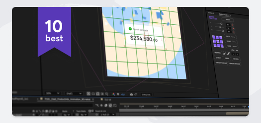
- Choosing the right tool: why Rive was a game-changer. Why Rive? Because it lives at the perfect intersection of animation and real-time interactivity. Standard prototyping tools could feel clunky. Rive, with its powerful state machines, allowed us to build fluid transitions, responsive hotspots, and subtle animations that react instantly to user clicks. This made the demo feel less like a presentation and more like a living, breathing piece of software.
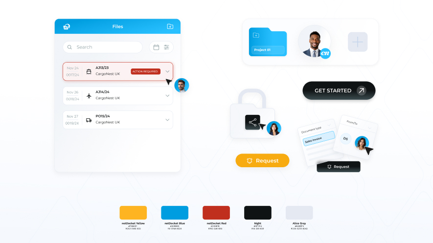
- Weaving a consistent design language. A great demo shouldn't feel separate from the product it's showcasing. It needs to be part of a seamless brand universe. We meticulously integrated the custom gradients, typography, and refined UI elements we had already developed for netDocket’s website and product animation. This obsessive consistency means that whether you see their logo, watch their promo video, or click through the demo, you’re instantly grounded in the world of netDocket. It just builds trust through familiarity.
Behind the scenes: a word from our Lead Motion Designer
We asked Szymon, our Lead Motion Designer, to share some of the real-world challenges and breakthroughs from the project. His insights reveal the detailed craft behind the seamless final product.
“The magic of a demo like this is the interactivity. The user is a participant, not just a viewer. But when you combine that agency with compelling design and dynamic animation, that’s the key to success. Our biggest internal challenge was managing the sheer number of elements. To avoid getting lost, we had to be incredibly disciplined with the project’s structure, adhering to clean naming conventions, organized layers, and a clear plan for every single animation and interactive element. We leaned heavily on Rive’s nested artboards, which let us build and modify components in isolation, keeping the main workspace clean and manageable. From a technical standpoint, the most grueling limitation was the preview process. To test a change, you had to click through the entire sequence from the very beginning. If you spotted a bug, you had to do it all over again to analyze it. It was a patient, sometimes tedious loop of 'click, test, repeat,' but it was necessary to get everything perfect.
That process, however, makes the breakthroughs incredibly satisfying. The best moments were cracking the interactive puzzles – like figuring out the logic to make a label appear seamlessly the instant a cursor hovers over a specific field, and then disappears just as smoothly. That’s when you know you’re truly crafting an intuitive experience, not just animating a video.”
The final result: more than just a demo
The outcome is a lightweight, interactive preview that replaces a long-winded explanation with a moment of discovery. Instead of overwhelming potential users with features, it gives them just enough agency to spark genuine interest. For a startup like netDocket, this translates into tangible advantages:
- A powerful first impression: it replaces abstract promises with a tangible experience for investors and key partners.
- A versatile sales asset: it serves as a powerful centerpiece for landing pages, pitch decks, and email campaigns.
- A unified brand presence: it solidifies a cohesive brand story across their video content, website, and the demo itself, signaling professionalism and attention to detail.
Why it matters: cohesion is a startup's superpower
Early-stage startups often struggle with a fragmented identity: a logo from one designer, a website from another, and a product promo created as an afterthought. With the Interactive Product Demo as a cornerstone, netDocket launched with a powerful, cohesive narrative. It's a story told through consistent branding, motion-first principles, and a hands-on preview of their product.
In today’s SaaS market, that level of cohesion isn't a luxury. It’s the difference between being remembered and being scrolled past.
👉 Curious about how an interactive product demo could help your startup stand out? Let’s talk.